molina cards
valencia
2015


nowadays business are looking for a continuous renewal, the review of their corporative identity or branding is one of the resources to achieve that objective. we look for what is special about each brand and turn it into relevant and credible proposal, able to connect with their audience. we combine creativity and technology to achieve these goals. in this way we help our customers evolve, improving their situation positioning their brands on the market.
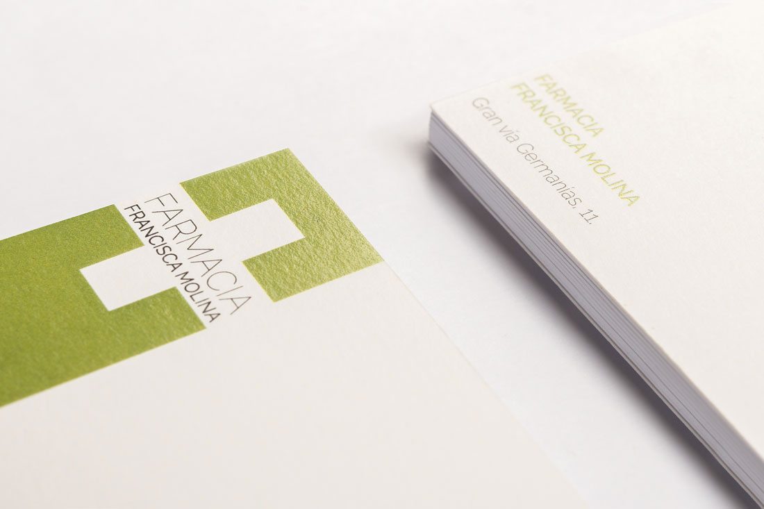
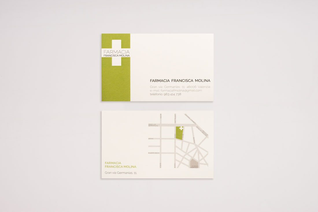
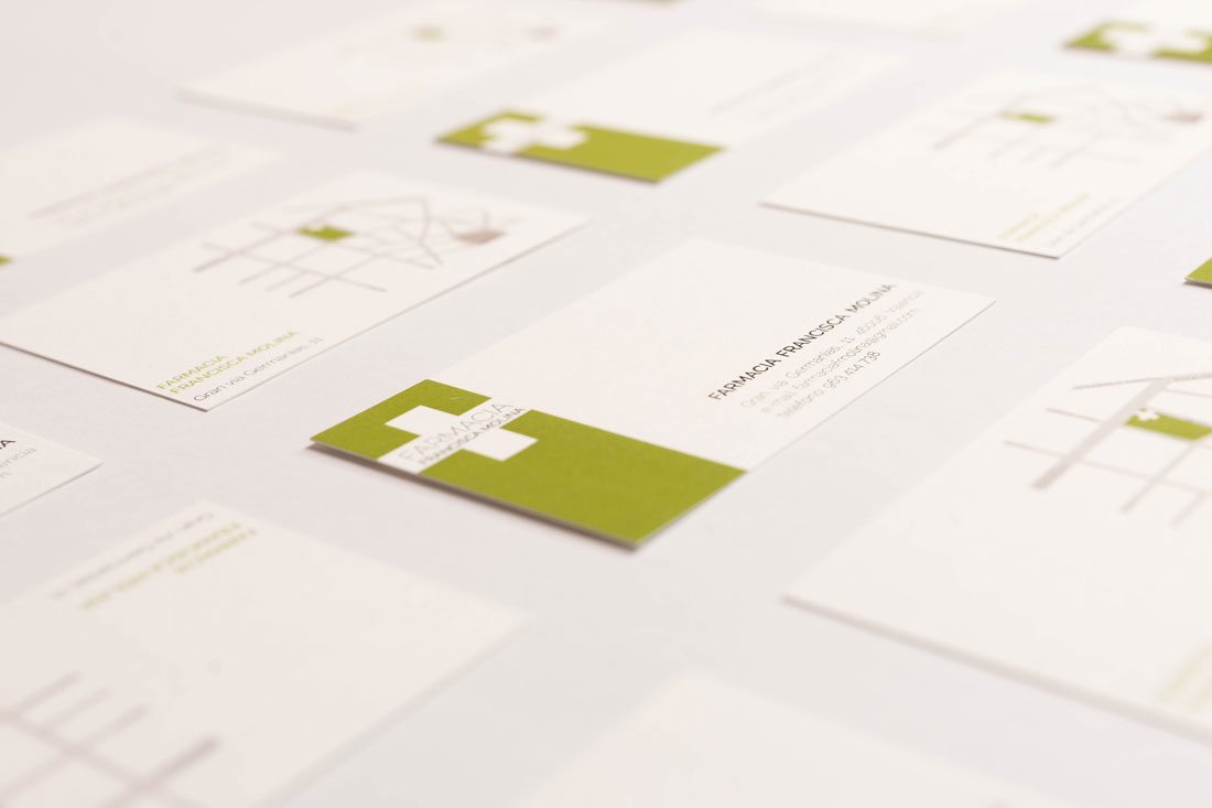
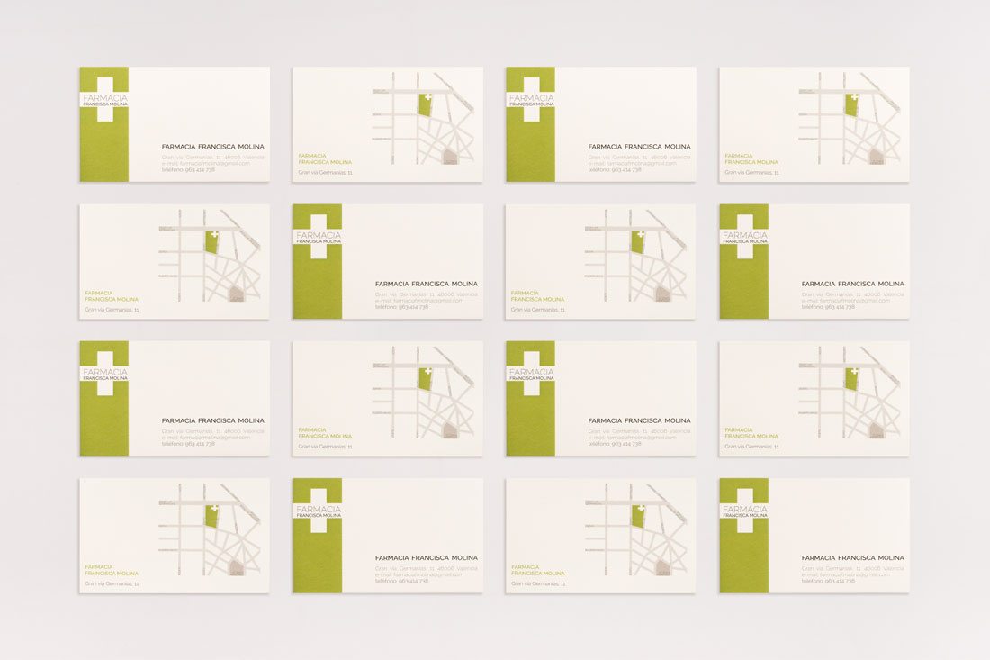
the owners of this pharmacy were looking for an easily reachable tool either for future customers and suppliers. this idea gets shape through a standardized format which is the business card, a recognized mechanism, easy to carry and exchange.
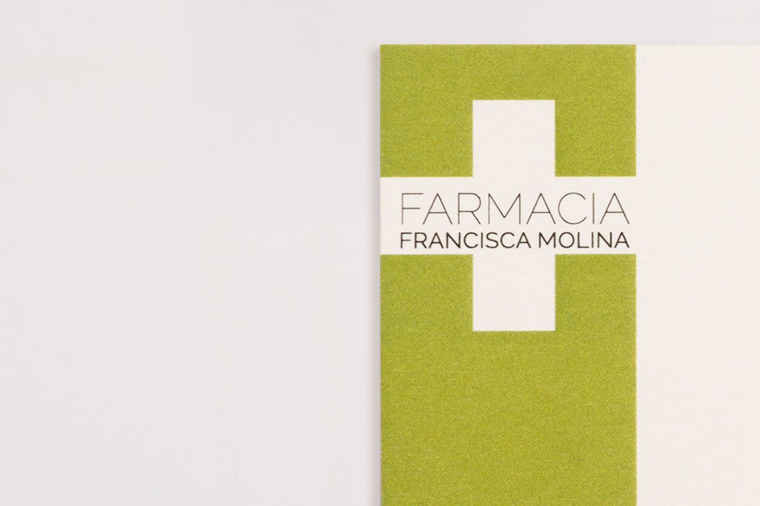
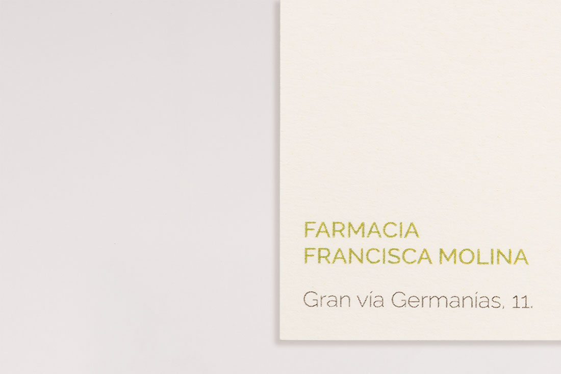
the new design seeks elegance and readability. the visual identity is simple, streamlined and modern. it incorporates classic and identifying elements of a pharmacy as the cross and the green colour, which contrasts with touches of other colours and the typographic choice. the composition and the texture of the paper complete the design, giving traces of tranquillity and simplicity in the graphic design of this business card.
business card, graphic design
phostos by borja rueda photograpy