coloma branding
Alicante
2014
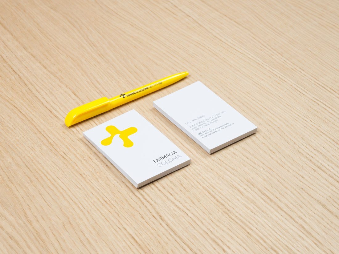
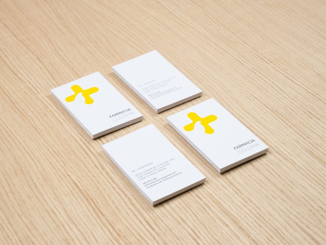
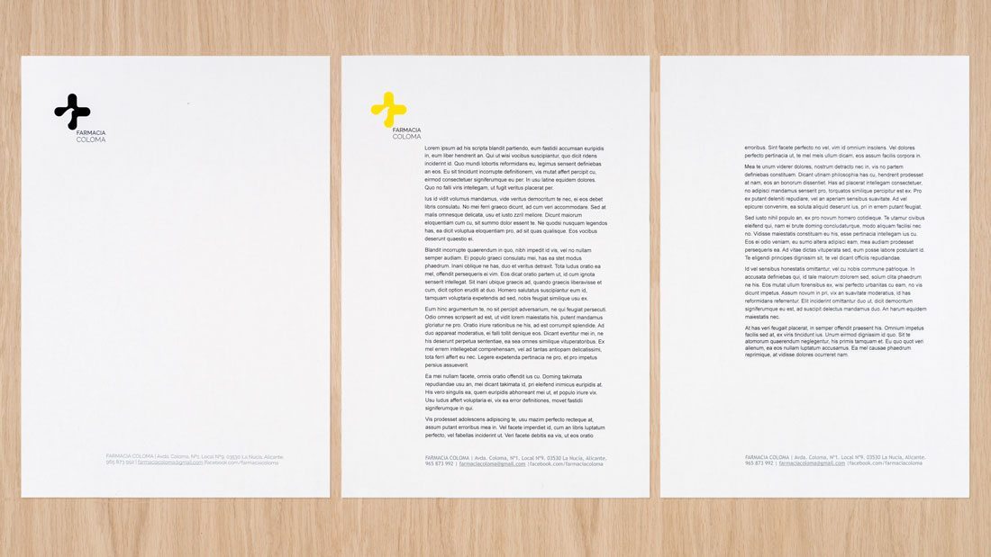
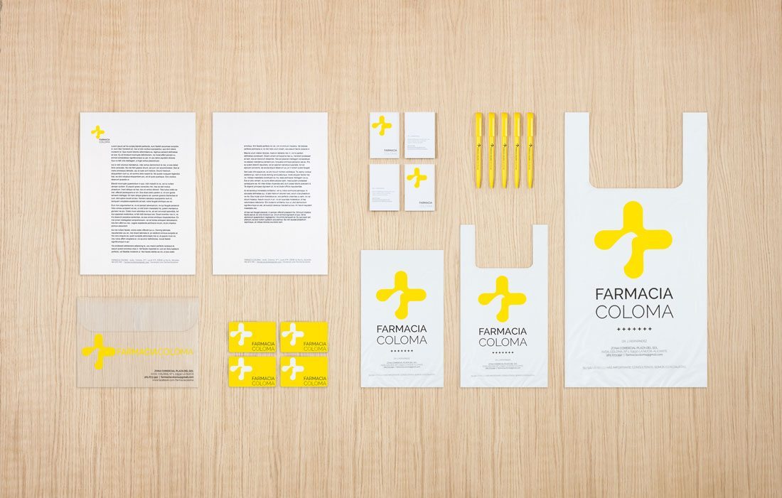
the complete project features the integral reform of a local destined to the sale and counselling of pharmacy products, where architecture and corporative design link to achieve an only goal. a simple and timeless atmosphere define the space of the coloma pharmacy, concepts that also appear in branding.
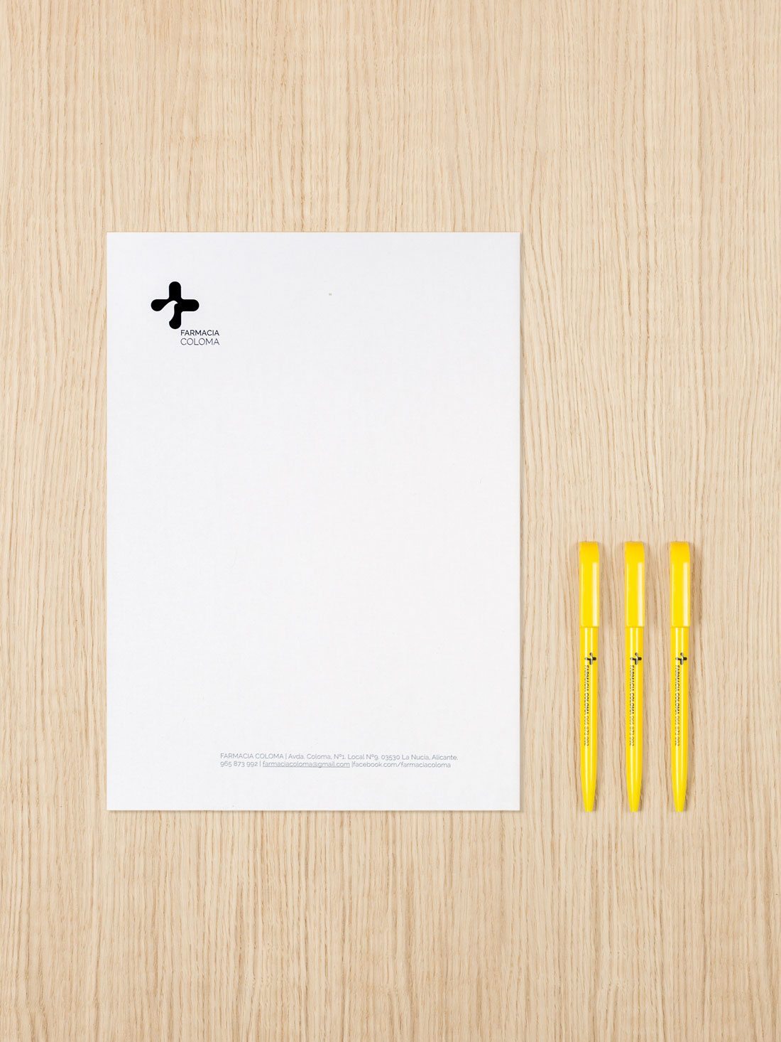
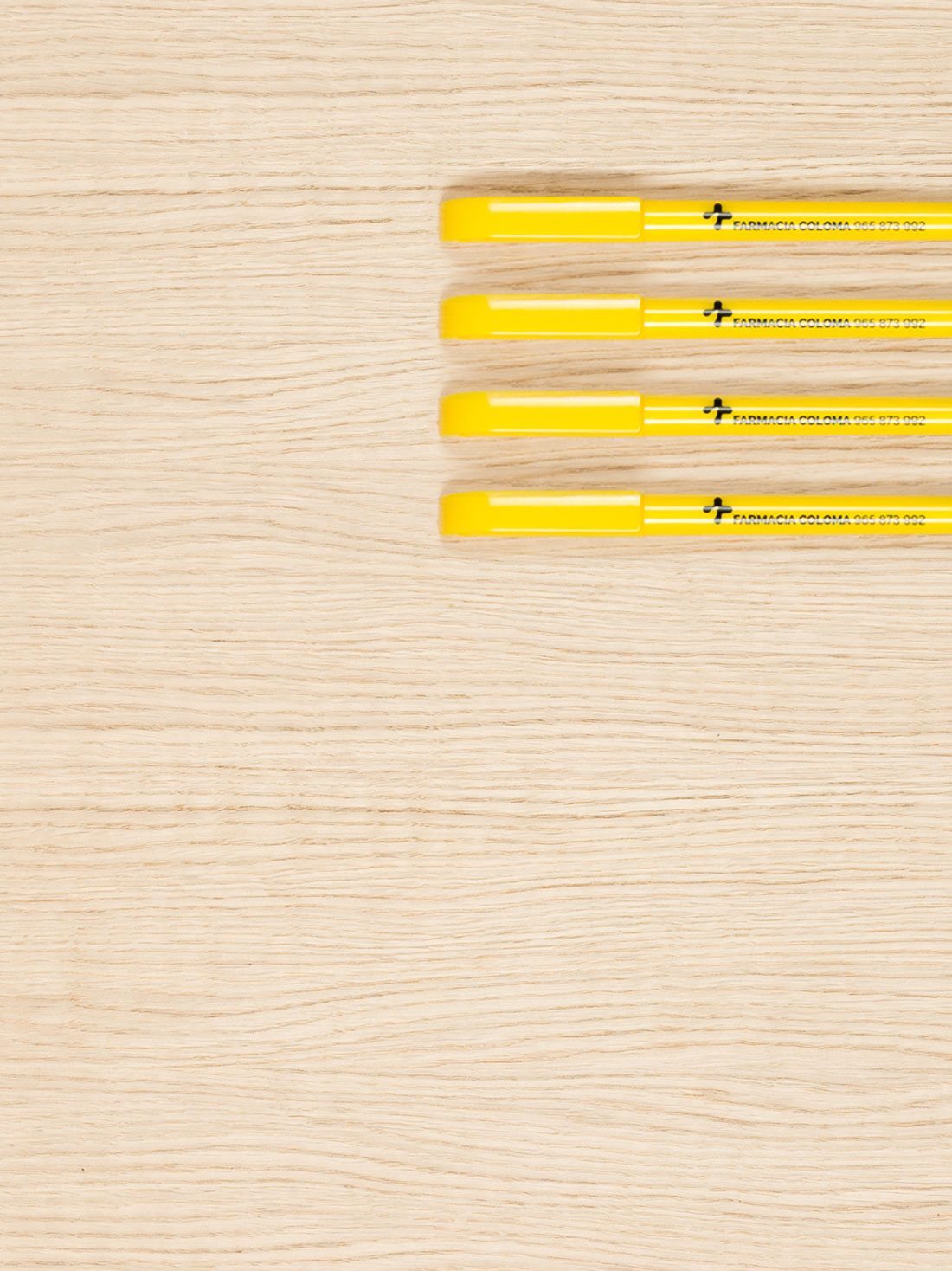
the elements from the corporative image are divided in two groups, the first one are a series of objects such as bags, recipe covers, business cards for the clients, the other one features elements that ease the workers task, like visitation cards, corporative papers, pens and uniforms. on them the logotype stand out for a yellow cross with rectilinear geometry that coexist with sinuous curves that combine with a pigeon. the choice of this bird it´s because the local is place at the coloma avenue, that comes from valenciano and means pigeon. the typography is unanimous through all the branding elements, visitation cards, bags, uniforms… and the architectonic ones like the facades.
cliente farmacia coloma
branding, graphic design
photos by borja rueda photography
